Monte Carlo Simulations — See the Range of Futures (Not Just an Average)
Most investing charts show one line. Real life gives you many.
A Monte Carlo simulation embraces that reality: it runs your plan through thousands of plausible market paths to show ranges of outcomes, probabilities of hitting your goal, and what could go wrong — before it does.
This post explains what Monte Carlo is, how to read it, when to use it for ETF portfolios, and how Libra Invest turns it into practical guidance you can actually follow.
What Monte Carlo is (in one minute)
- You start with a portfolio (e.g., 60/40 or 80/20), assumptions for returns, volatility, and correlations, plus cashflows (contributions or withdrawals), fees, inflation, and a rebalancing rule.
- The simulation draws many random market paths consistent with those assumptions.
- You get a distribution of outcomes: not “the” future — but a realistic set of futures, including good, bad, and ordinary ones.
Think of it as a flight simulator for your plan. You practice through turbulence before you take off.
What questions it answers (for ETF investors)
- Will I reach my goal? (probability of hitting a target wealth by a date)
- Am I saving enough? (savings rate needed to reach an 80–90% success chance)
- Is my mix too risky for withdrawals? (risk of depletion in retirement)
- How bumpy could it feel? (drawdown depth and time-to-recovery, not just averages)
- What if inflation/fees are higher? (sensitivity tests)
How to read the charts
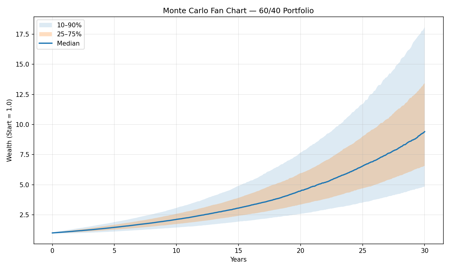
Figure A
- Imagine releasing thousands of paper airplanes with slightly different wind conditions. The dark band is where most of them land; the light band covers almost all reasonable landings.
- A narrow fan means outcomes are clustered (more predictable). A wide fan means outcomes spread out (less predictable).
- Practical read: look at the lower band (e.g., the 10th–25th percentile). If that lower band still clears your goal, your plan is robust. If it dips below your goal, you can save more, extend the horizon, or dial down risk until it clears.
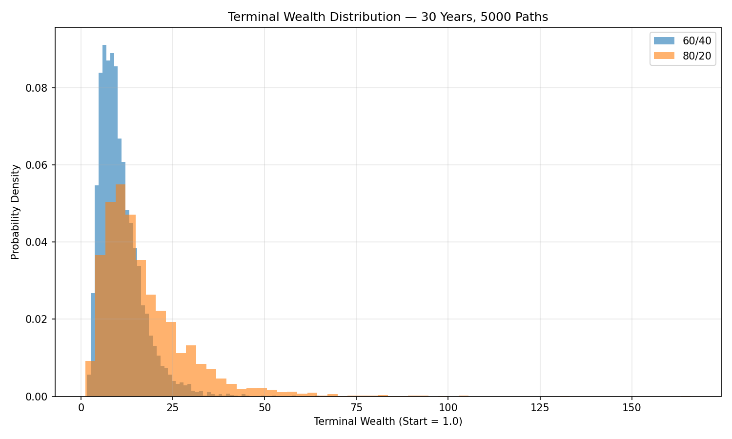
Figure B
- Each curve shows how often you end up with a given final portfolio value after 30 years.
- 80/20 pushes the right tail out — more big wins — but also pushes the left tail — deeper bad outcomes.
- Practical read: if you’re accumulating (adding money), the extra upside of 80/20 can be attractive if you can tolerate larger swings. If you’re withdrawing, the fatter left tail can be dangerous; a steadier 60/40 may better protect your plan.
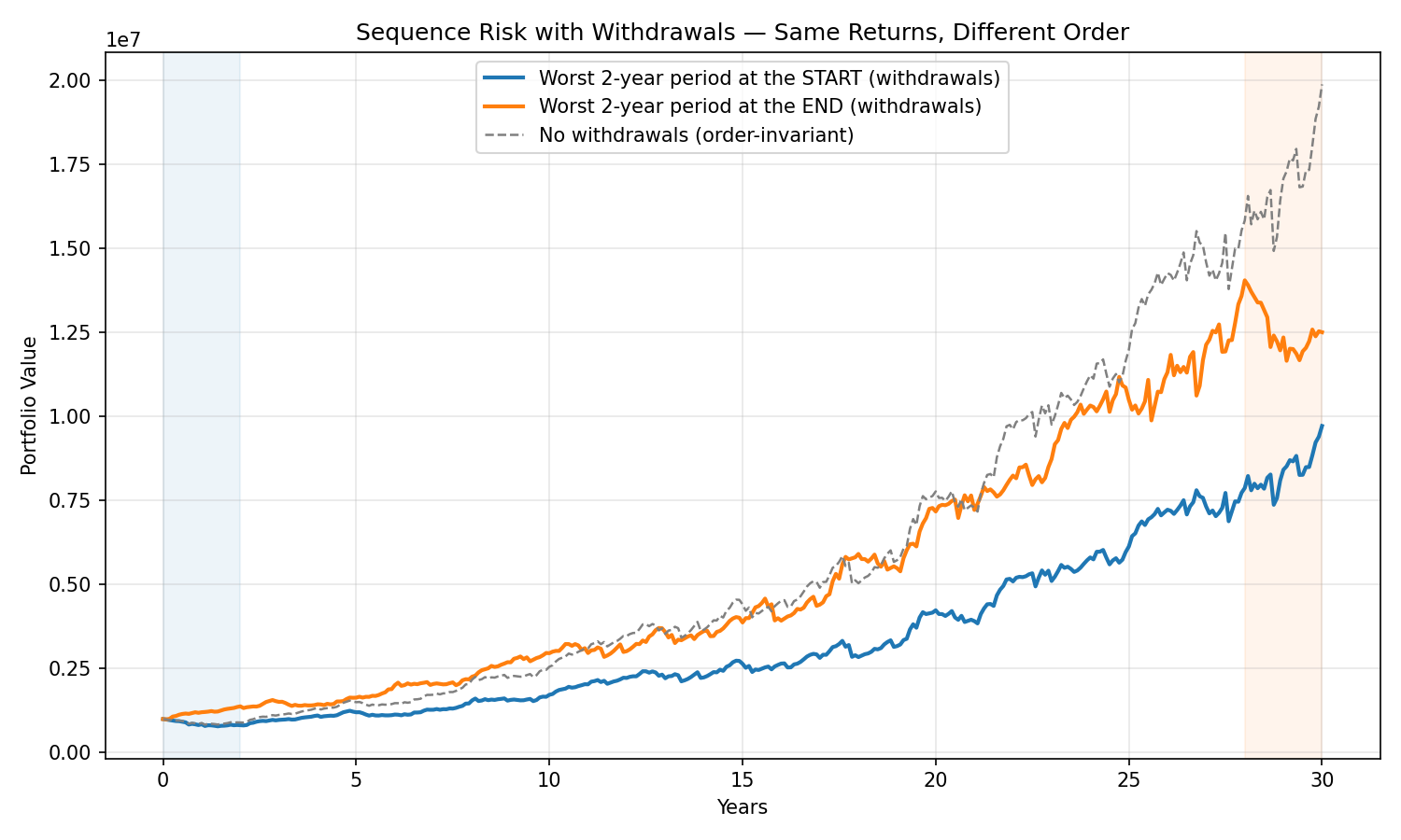
Figure C
- Two journeys, same long-run return, different order of good and bad years. With withdrawals, early bad years shrink the nest egg before later recoveries arrive — like removing bricks from the foundation and then adding weight.
- Without withdrawals, the order doesn’t change the final value much; with withdrawals, order matters a lot.
- Practical read: if you’re spending from the portfolio, reduce sequence risk by (a) keeping 1–2 years of spending in safer assets, (b) using spending guardrails (temporarily trim raises after a big drop), and (c) rebalancing by rule so you’re not selling the most beaten-down asset to raise cash.
Inputs that matter (and how to keep them sane)
- Return & volatility assumptions. Use long-horizon, diversified estimates (not last year’s returns).
- Correlations. Stocks and bonds don’t always offset each other; correlations can rise in stress.
- Inflation. Model results in real (inflation-adjusted) terms when planning spending power.
- Fees & taxes. Small annual costs compound; include them.
- Cashflows. Contributions (accumulation) or withdrawals (retirement), with a simple rebalancing rule.
- Fat tails & regimes (optional). Markets see big, clumpy moves; robust simulators allow heavier tails or “bad regimes.”
Rule of thumb: don’t chase precision. Reasonable ranges and sensitivity checks beat heroic forecasting.
How to use Monte Carlo at different stages
While you’re saving (accumulation)
- Pick a success target (e.g., 85% chance of reaching the goal).
- Adjust savings rate or timeline until you’re there.
- Choose a stock/bond mix whose drawdowns you can sit through (the fan chart helps).
When you’re spending (decumulation)
- Stress-test your withdrawal rate (e.g., 3.5–4% real) against poor early returns.
- Consider guardrails (raise/lower spending a bit if the portfolio crosses bands).
- Keep 1–2 years of spending in safe assets if sequence risk worries you.
When markets get rough
- Look at the percentiles, not one line. “We’re tracking the 30th percentile path” is a useful mental anchor.
- Rebalance by rule, not by feel; let the plan harvest volatility rather than react to it.
Common pitfalls to avoid
- Garbage-in → garbage-out. Fancy simulation with unrealistic inputs is still fantasy.
- Confusing probability with certainty. An 85% success chance still leaves 15% to plan for.
- Ignoring inflation and fees. They’re slow but relentless; include them.
- Over-optimizing on a single metric. Look at success rate, worst-case drawdowns, and time underwater, not just medians.
A quick starter checklist
- Define the goal: amount, horizon, and currency (real vs nominal).
- Pick the core mix: simple ETF sleeves (e.g., global equity + high-quality bonds).
- Set a rule: calendar rebalancing or bands, contributions/withdrawals schedule.
- Choose a success bar: e.g., ≥85% probability.
- Run sensitivities: inflation +1–2%, fees +0.5%, returns lower by 1–2% — would you still sleep at night?
How Libra Invest helps
- Fan charts you can trust. We use evidence-based ranges for returns, volatility, and correlations, with options for fat tails and stress regimes (e.g., 1970s-style inflation or 2008-style crashes).
- Plain-language answers. “You have a 78% chance of meeting the target; saving $180/month more raises that to 88%.”
- Behavior-ready design. We show drawdowns, time to recovery, and spending guardrails, not just terminal wealth.
- All-in realism. Fees, inflation, taxes, and your rebalancing plan are embedded — no rose-tinted lenses.
- Actionable tweaks. Small changes with big impact — e.g., adjust the equity sleeve by ±5%, shift bond duration, or tweak savings cadence.
Bottom line
Monte Carlo doesn’t predict the future — it prepares you for a range of futures.
Use it to choose a portfolio (and a savings or spending plan) that you can stick with even when the path is bumpy. The discipline to follow that plan, informed by realistic ranges, is where compounding does its best work.
Curious where your current plan lands on the fan chart? Libra Invest can simulate it, show your probability of success, and suggest the smallest changes that make the biggest difference.